Monday, 7 November 2011

Client Meeting

Today I met with the client and presented my initial ideas for their cover. In order to develop the design further I needed to know which ones they liked, what they didn't like, which features they wanted or changed etc. This is a summary of the feedback I recieved:

  • These two cover were their favourite.
  • They liked the gramophone and the colourful waves coming out of it.
  • They wanted a more defined image of a blue jay on the cover (like the one on the right) instead of the white silhouettes.
  • If I could get the blue jay interacting with the gramophone in some way (flying from or looking in)
  • Doesn't need the border but likes the textured background
  • Liked the vintage theme I was going with
  • Definitely want something this colourful (left design)
And in terms of logo design:
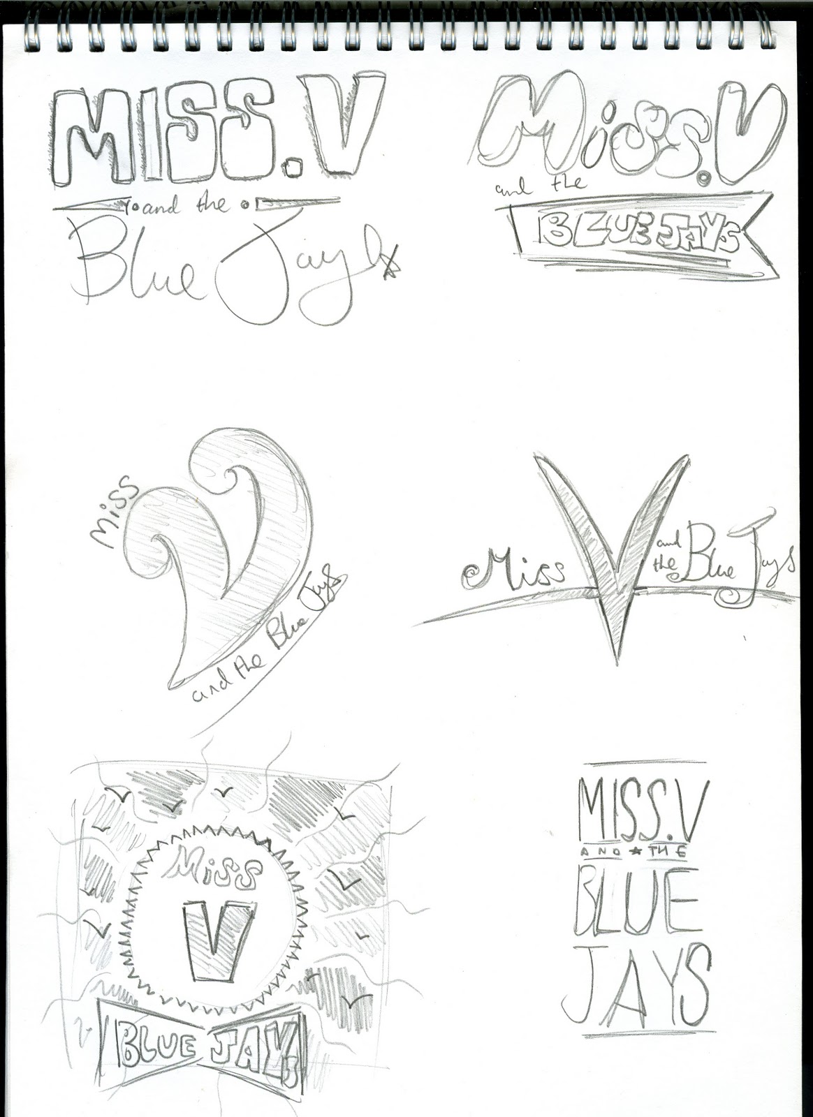
  • These were the two logos they favoured the most
  • Overall they like the one with the banner (right) the most but preferred the typeface used for "Blue Jays" in the first logo. They wanted me to somehow include that typeface into the banner of the other design
  • They're also changing their band name to "Ronnie and the Blue Jays" so I would have to change the "Miss V" for the finished piece.
Based on this feedback I'll be creating a final design proposal for the band which hopefully incorporates all the things my client outlined. I will email them further updated versions during the next week and be in contact more often in order to make sure they're completely satisfied with the final design when the deadline comes.

Overall I felt the meeting was a really positive experience and feel I have a greater understanding of what the band are trying to go for. They said they were very pleased overall and looked forward to seeing the finished version.

Sunday, 6 November 2011

Another Cover Idea

This is another idea I came up with recently. I wanted to show the client something a bit simpler in its design. I also wanted to create a cover based around the typography I'd used for the logo. For this idea I used a stylized tattoo style image of a bird (coloured to look like a blue jay) which is a link to rockabilly imagery which is often based on classic tattoos of birds, roses, skulls, hearts etc from the 1950s.

I also experimented with distressed textures for use on the background, just to create that more vintage look about the album cover, as apposed to just filling the background in an off-white colour in Illustrator. I thought this might bring out the illustrations and the type and make the design look less flat. It also could create the illustration that the imagery has been painted onto that surface or written on in ink (in the case of the logotype) further emphasizing the vintage feel that the client wanted.

Saturday, 5 November 2011

Developing Cover Ideas

This is one of the ideas I developed from the sketchbook. I wanted to go for something that resembled that 50s illustrative style, trying to make the image of the blue jay more stylized. Developing this in Illustrator allowed me to experiment with different colour combinations in order to make something vibrant but also suggesting that slight vintage feel. Thats why I went for lots of pastel and slightly off-colour shades of various vibrant colours. I do like this design, I think it's quite eye-catching, however the coloured waves are a bit messy and could be made smoother and more consistant.

This idea was partly inspired by Imelda May covers that feature an almost silhouette of a woman featured in the design. This cover was designed around mixing rockabilly imagery with floral brushes to suggest the more natural, flowing nature of soul music. Again I went for a more stylized design using vibrant colours against the off white 'torn paper' style background which is inspired by many posters from the 40s and 50s and is often associated with 'retro' influenced design. I used the floral brushes I'd found through researching illustration techniques. Making something that looked very natural proved quite difficult but I was quite happy with the result. It does need development though, but that will be decided by the client if they like the initial idea.

For this idea I tried to create something with a bit more energy, without turning it down so much to see how the client would like it. I experimented with creating different brushes in Illustrator and settled on a rainbow colour brush I made using the line tool. These colourful patterns are more influenced by funk albums from the 70s and covers like Josh Stone's album. The client was interested in seeing lots of bright imagery so I tried to include a range of different things emanating from the gramophone speaker.

I'll show these designs to the client during the upcoming meeting on the 7th November and ask for their feedback.

Friday, 4 November 2011

Further Developed logo

Using an order design as a basis I created this logo based on the vintage style typography I'd found earlier. I went for that more ornate style and I think it turned out really well. The typeface is consistant throughtout (Ballpark) and looks really appropriate in the banner. The banner itself creates a nice visual contrast to the 'Miss V'. I also adjusted the size of the M and the V to add a more curvy style to the logo. I then added the enlarged swoosh at the end of the V. I think I've achieved that black inky style that I was originally interested in, and it should lend itself to the floral imagery that I've been experimenting with in my sketchbook.

More Vintage Typography

I was really interested in developing a logo based on old vintage type styles so I looked into typography that was designed around the early half of the 20th century. I really like the ornate handwritten style and the very inky way it's rendered. Alot of the swirly designs below would be suitable for my brief as I've been trying to create something with swirls and curves to link with the retro feel of the band.


These vintage typography designs were created by Simon Walker and can be found on his flikr and journal.

Developing Logos

Based on my ideas and research on retro typgography these were the logos I developed in Illustrator

This idea uses 'Ballpark' for the Miss V and 'Reklame Script' for the Blue Jays. I was going for that 50s handwritten script style with this logo, whilst including that stereotypical mixture of two typefaces that were common in advertising. I wanted a light-hearted feel which is another reason for choosing a script typeface. I think using two typefaces is appropriate as it allows 'Miss V' and 'Blue Jays' to stand out from each other without putting too much emphasis on one or the other.

Similar to first idea but using a more rigid condensed design for the bottom half. I was inspired by 50s signs for this one and how they mix a script typeface with san-serif typefaces. This design has alot of visual impact and it does project a certain air of glamour about the band, especially with the star there. The typeface for the bottom half is DIN. I chose it because it has that corperate feel which was often associated with 50s advertising and company logos.

This logo is another play on logo designs from the 50s. The curvy borders and use of shadow. The typeface for this design is 'artbrush'. This design is slightly more playful I feel.

Wednesday, 2 November 2011

Sketching Ideas

Using the research I've been doing I decided to start sketching some visualizations and cover ideas. I started off by trying to identify concepts I could base my designs on. One of these was taking the 'Blue Jay' from the band name and using that as a basis for some of the designs, incorporating the image of a blue jay (or birds in general). I tried to create a stylized version of the Blue Jay picking out key features from it's colours and shape.

I also wanted to show a mix of rockabilly and soul in my designs which led to ideas based around mixing things like rockabilly hair styles with floral imagery.

Some ideas were based around adding that retro feel that the client said she wanted. Ideas such as the gramophone spouting birds or other colourful imagery.


I also started brainstorming ideas for the logo. I wanted the logo to show influences from typography from the 1950s as this relates directly to rockabilly music and the advertising style used to promote rockabilly. The name itself, Miss V. and the Blue Jays, sounds like an old fashioned band name from that era.

Alot of my ideas for the logo focus on some sort of script style typeface that was very common in the 1950s on posters and advertising. Designers often used two or three different typefaces on the same piece of design. There was a light-hearted upbeat feel to alot of this type which I think is appropriate for this brief.