I also wanted to show a mix of rockabilly and soul in my designs which led to ideas based around mixing things like rockabilly hair styles with floral imagery.
Some ideas were based around adding that retro feel that the client said she wanted. Ideas such as the gramophone spouting birds or other colourful imagery.


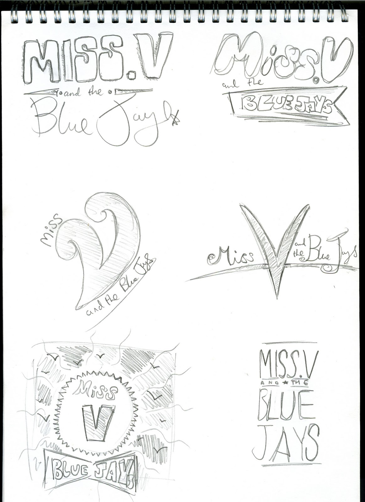
I also started brainstorming ideas for the logo. I wanted the logo to show influences from typography from the 1950s as this relates directly to rockabilly music and the advertising style used to promote rockabilly. The name itself, Miss V. and the Blue Jays, sounds like an old fashioned band name from that era.
Alot of my ideas for the logo focus on some sort of script style typeface that was very common in the 1950s on posters and advertising. Designers often used two or three different typefaces on the same piece of design. There was a light-hearted upbeat feel to alot of this type which I think is appropriate for this brief.

No comments:
Post a Comment